This whole Web site thing has gotten out of control. It was supposed to be simple — a place for people to read the story, comment, and toss a few shekels in the hat if they were so inclined. But now . . . .
It’s my own damn fault, as these things tend to be. A half-dozen long attempts have been made to finish this paragraph, but it all devolves into more personal info than would be wise to share here. And really, who cares? This isn’t about me, it’s about the work. Sometimes that’s the same thing, but not today.
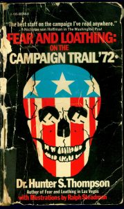
 In 1990, I paid a whole buck-fifty for this copy of the campaign book. The El Cajon bookshop I bought it from has since shut its doors, though they seem to have a thriving online store. The cover was in a lot better shape back then and pages didn’t smell like stale cigarettes.
From the very beginning, the title for my story was going to be Fear and Loathing of the Undead ’78. It immediately sets the tone and nails the action to a specific — and, I believe, critical — time in Hunter’s life. So when faced with having to create visuals for this site, Thomas Benton‘s iconic cover seemed like a good place to start riffing. His imagery is elegant and powerful: death, politics, America, Nixon, fear and loathing. The pieces started falling into place and I knew I was heading in the right direction.
Work started in early October. The image below is, for the most part, first-draft stuff. Except for the hands. I suck at drawing hands, so they took the longest to get just right. Then it was a matter of tinkering with the text.
 For those who can spot these things, and there are many of you, I had to use News Gothic. It doesn’t quite match — not thick enough — but it’s the closest thing in the system right now. News Gothic Black or News Gothic Black No. 2 should do it, though I’m open to suggestions.
Keeping the text as close as possible to that on the campaign book was important. As good as the “Author of . . .” line looked under Hunter’s name, I was advised to take it out — a worry over using someone else’s work to promote my own. If anybody would know about that kind of thing, it’s Agent Joe, so the line was yanked.
Aging the cover was a last-minute a fuck-around. I saw the bashed-to-hell copy laying on my desk, liked the look and asked the wife if she knew how to do that kind of thing. She said no, but would look into it. She’s good like that. Meanwhile, I started messing around and came up with something usable for now.
There are a few other ideas in the hopper: a grinning skull with a Tar-Guard clamped in its teeth and a pair of aviators over its eye sockets, Nixon Fingers reflected in the yellow lenses; a rotting hand punched out of Nixon’s grave to flash the victory sign; some kind of zombie riff on Steadman’s first edition cover art for the Vegas book — though that’s horrible enough (in a truly good way) to not be much of a stretch.