The original draft of the Junior Mad Scientist review of Bye, Bye, Baby included a drubbing of book’s the less-than-stellar cover art that made crappy by association what was really a quality read. Rather than risk splashing the text while pissing on the cover, all discussion of the upfront image was removed and saved for later.
Wella, well . . . poking around Max Allan Collins’s Website, it seems the man himself is none too pleased with what will be people’s first impression of his latest work:
“I’ve stirred some interest and even commentary on my admitted displeasure with the cover to the new Heller. I am pleased by the quality of the photograph, and thrilled that my publisher ponied up for a major photographic shoot from the excellent Thalicer Image Studio. But because of fears that the MM estate might object to too overt a Marilyn image, the publisher chose what I consider to be the weakest (and certainly most historically inaccurate) of the photos from the shoot.”
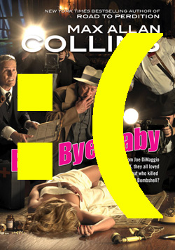
Since the other cover options are not available for review, it’s hard to argue with him. And while the chosen cover is flaccid and dull, it manages to attract the eye and direct it around the primary sights. Here are the excised chunks of the of the original review with full analysis of how the image works.
POST 08152011 SITE=JMS +++ EMAIL PUB W/LINK
HEADLINE –– Book Review: Bye, Bye, Baby by Max Allan Collins
(INSERT COVER)
A good book with a bad cover is like a dead kitty on the tollway. Driving past it, you wonder who was supposed to be taking care of the forlorn thing, think it deserved better, then wonder how long it’s going to lay there. Max Collin’s latest Nate Heller memoir Bye, Bye, Baby is that dead kitty.
[Hey, it’s me again. Just so you know, the majority of the review –– all the stuff about how good the text is, etc. –– came from right here. OK, roll tape.]
Staged photos like this, especially on a fiction cover, are less effective than an auctioneer with a bad stutter. The photo on Bye, Bye, Baby lacks not only luster, but nearly anything related to the story inside. (The title is one of Marilyn’s songs from Gentlemen Prefer Blondes; that point goes to Collins, not the book’s designers.) More than probably, the lack of relevance is due to Marilyn’s image or likeness being heavily copyrighted and/or trademarked, and the publisher not wanting to shell-out for using it. Not that I blame them; that kind of thing has got to be expensive. And with publishing costs being what they are today, if there’s a reason and a way to avoid adding to the overhead, all to the good.
Which gets us back to an illustrated cover. Any talented artist could have pulled off something really intriguing that more heavily hinted at, but didn’t show, the corpsified Marilyn, and for a lot less than the cost of staging a shoot.
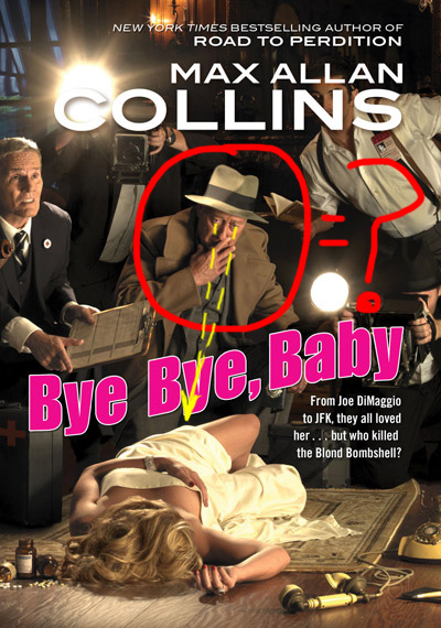
And while there are several other gripes about the photo –– including the inaccurate death scene and the fedora-sporting geezer eyeballing the dead girl’s ass –– the time has come for it’s one and only good point: an effective use of space and white to guide the eye.
Stay with me here . . .
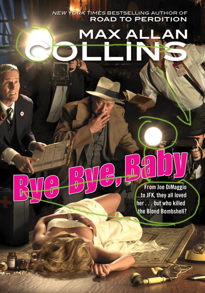
The starburst camera flash in the upper left corner attracts the eye and drags it across the white of the author’s name to the reporter’s black suspenders framing his white shirt; the V of his open collar, the shirt buttons, suspenders and the angle of his torso draw the viewer’s eye down to the second camera flash a fraction of an inch above the hot pink title –– also outlined in white. From here, the eye might go two directions: flick along the lilting title back to it’s beginning or down to read the single sentence synopsis below before taking in the title. The second scenario seems most likely because those letters are also in white.
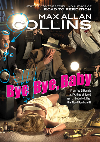
Either way, the title will be read because the panicky-looking guy in the suit to the left, just under the flashblown C. His highlit hair, white teeth, white collar, the white slashes in his tie, the lapel button, the lined papers on the angled clipboard and the index finger of his right hand lead the eye down to the dead girl with the nice rack. And oh, look –– there’s a hot pink title between his finger and her chest.
Along with her ample bossoms (which are strangely free of cleavage), the dead girl’s glittering bracelet, satin sheet and telephone receiver conspire to draw the eye down and through the image. Note the ivory colors and off-white tones of the sheet, rug and phone. This is because the body is the eye’s final resting place (as it were), not where the eye should start.
But look how the angle of the girl’s knee directs the eye back up to the white camera flash again, and how the title gets in the way. Funny how that works.
Central to all this is the septuagenarian detective –– who looks nothing like the fiddle–fit Heller described in the book.
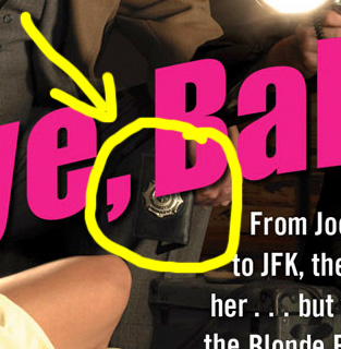
Sure, Heller wears suits — also sporty casual clothes, polo shirts, white jeans — and admits forgoing hats thanks to the trend set by JFK. Who this moist-eyed basset hound is supposed to be is anyone’s guess. LAPD, maybe? If you look reeeeeeeal close, he’s holding a badge.
So confused . . . .
Knowing the mechanics of the cover still doesn’t make readers/buyers unfamiliar, or even slightly familiar, with Heller or Collins want to pick it up. Because the cover is boring and displays almost nothing of the real mystery inside.
And why there isn’t a well-placed banner showcasing this as A NATE HELLER MYSTERY, I can only imagine. Most readers like a good series. The Heller memoirs may not be what anyone would consider a traditional mystery series, but after more than a dozen books, that’s pretty much what it is. When you’ve got a nice backlist, why not show it off?
For those who read it and recognize it, an author’s name can overcome uninspired, barely functional cover art. In some cases, the author’s name is all that’s needed: Stephen King, James Patterson, Amanda Quick, Dan Bown.
(. . . gag . . . ack . . . Sorry. Threw up a little in my mouth on that last one.)
Unfortunately, Max Allan Collins doesn’t have quite that level of recognition. Christ only knows why. It’s not like he doesn’t deserve it. Perhaps it has something to do with publishers wrapping his books in crappy cover art.
Still and all, beyond an author’s brand name, a good cover is what gets a book into people’s hands. Hell, even wine makers know this. Over the last several years, label design has gone through a major shift because what’s true of books is true of wine: buyers judge contents by what’s on the outside. (This is also true of mail-order brides –– though that industry has a narrower consumer base than the other two up for discussion.)
Good art on bad wine sells a lot of bad wine. Bad art on good books sells damned few good books.
Bye, Bye, Baby deserves much better than it got. Here’s hoping the paperback gets the right treatment.
(28 FEB 2012: comments section closed due to excessive spam. Please direct any comments to the address on the ABOUT page. Thanks. bjw)
